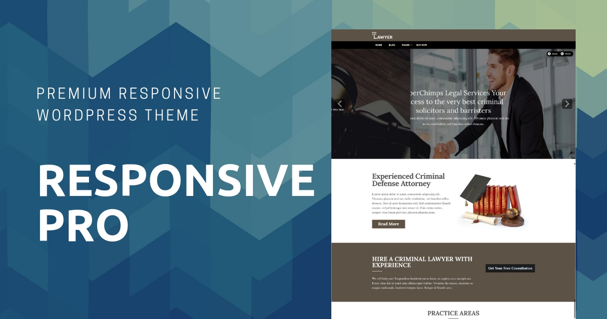
Responsive Pro is a straightforward WordPress theme with a classic design.
This popular WordPress theme is easy to set up and also gives you plenty of control over how your site will look and feel.
If you have already downloaded CyberChimps’ Free Responsive theme, you can now take things to the next level with the premium version – Responsive Pro.
BEST RESPONSIVE WORDPRESS THEME
Color Schemes
Choose any color from 12 beautiful colored skins options. You can select gray, aqua blue, dark blue, black, green, orange, pink, red, purple, yellow, brown, and teal.
Plugins Compatible
Out-of-the-box plugin support for bbPress, WooCommerce, Easy Digital Downloads, Jigoshop, SlideDeck3 and The Events Calendar. More plugins to be added soon.
Four Separate Menu Locations
Get separate menu options like Top Menu, Header Menu, Sub-Header Menu, and Footer Menu.
Fonts and Typography
This responsive WordPress theme supports Google Fonts and web-safe font families. As well as color pickers for different text types
Easy to Customize
Style background, logo/header, custom favicons, and Apple touch icons just the way you want.
100% Responsive Theme
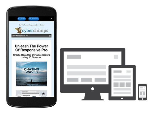
This responsive WordPress theme has a flexible foundation with fluid grid system that adapts your website to mobile devices and the desktop or any other viewing environment. Make website mobile friendly, any device friendly using Responsive Pro theme.
2 different home page layout possible
One with description & image other with Full width Image
Ability to choose different Site-Wide layouts ( Full-width & Boxed )
– Full-width layout in which the site covers up all the available screen size
– Boxed Layout in which the site is wrapped in a box structure
– Default Layout (For backward compatibility)
– Full-width layout without boxes in which there are no boxes on home page
Social Icon Sets
Choice of 4 trendy Social Icon Sets
Style Changes to Author Bio
Formatted Post details with icons for post date, time, etc.
Style Changes for Blog List Layout
Separators below each post and improved post listing layout
Easy to Use
Theme features 9-page Templates, 11 widget areas, 6 template layouts, threaded comments, and 4 menu positions.
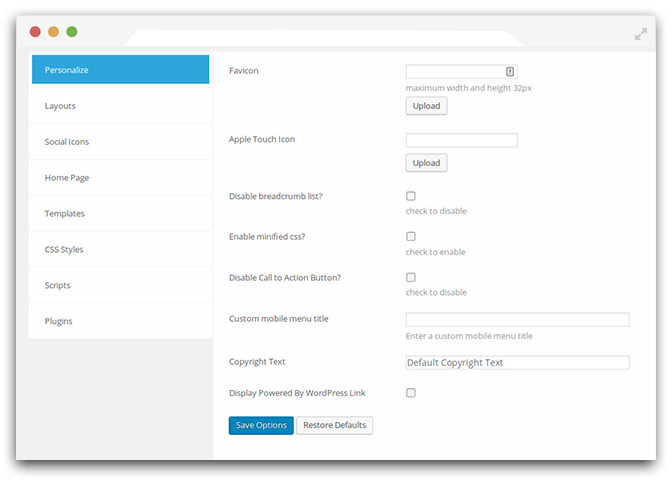
Full CMS Control
This responsive theme design comes with powerful but simple theme options with easy logo upload, social network icons, and webmaster tools.
WPML Compatible – Translation Ready
This theme is Multilingual Ready (WPML), RTL-language support (sidebar location mirrors), Retina-ready, search engine friendly (SEO optimized). Currently translated into 40 languages.
Cross-Browser Compatible
This multi purpose WordPress theme works perfectly across different browsers.
Child theme friendly
Create as many variations you want with this best WordPress theme.
WooCommerce
New WooCommerce templates for the shop page, single product page, cart page, checkout page, and my account pages.
Team Members
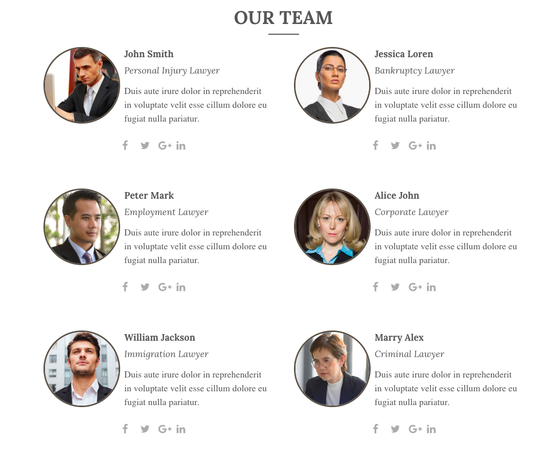
Showcase your Team Members profiles via the newly added ‘Team’ options
Testimonials section

Highlight positive feedback from your customers via the all-essential Testimonials section
About Us Section
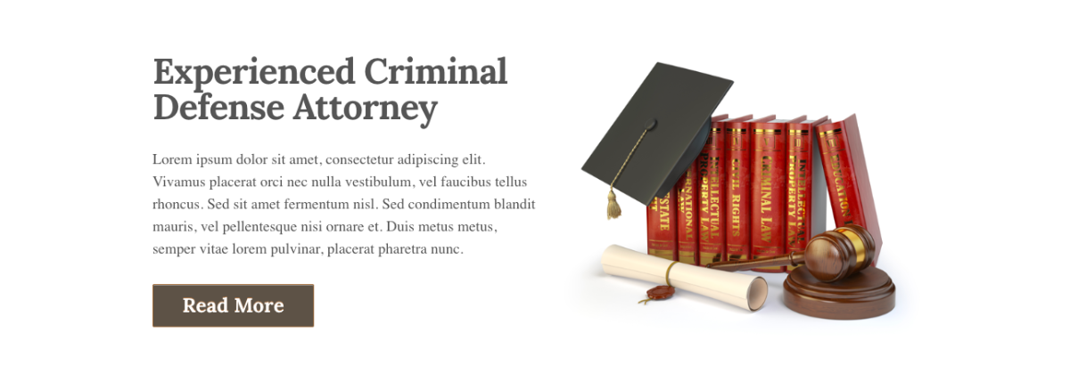
Feature your organization details to let your customers know all about you.
Features Section
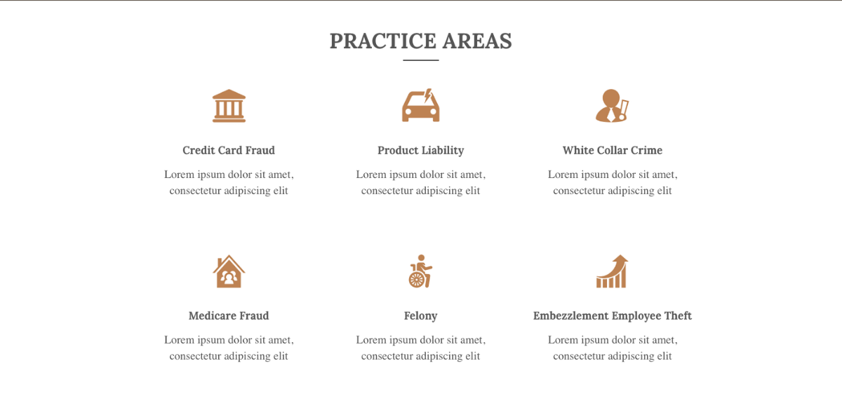
Highlight your organization features to promote your business
Contact Section
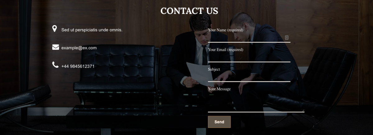
Provide your contact details with an impressive background image
Sticky header added
WordPress Theme Options Panel
Admin dashboard look and feel is intuitive and full of useful options to help customize the theme
We took a different approach when developing this responsive design theme – CyberChimps Responsive Pro, and worked with the community to figure out exactly how to improve the overall experience of building a website.
With over 1.3 million+ downloads and 100,000+ actives websites, using the free theme version, we know what it takes to develop a professional WordPress theme for anyone’s needs.

Responsive Pro adds exciting new customization features like the Theme Customizer which includes 12 colorful skins to select from, typography options with Google Fonts, and other powerful customization tools.
We also simplified the Theme Options panel, as well as built-in support for popular plugins including bbPress and WooCommerce.
With this multi-purpose responsive WordPress theme, you can easily launch a beautiful custom responsive website faster and easier than ever before. This multi-purpose WordPress theme has everything a developer needs in developing a professional website for any niche, business, company or organization.
Create your own responsive website using this responsive design theme and theme customizer. This responsive design theme strengthens your site and gives an awesome impression to your visitors but manages to do this while keeping everything simple and easy. Here’s a detailed article that shows you how to create a responsive WordPress website using Responsive Pro.
What is Responsive Web Design? Why Do We Need It?
With millions of users logging onto the web and browsing numerous websites through varied devices, what if a website doesn’t match up with a particular device? It is not possible for a website owner or designer to even imagine the different kinds of devices his users will be using to access his website. Should all those users who cannot use your website to the best of its ability lose out?
The solution is a responsive web design. This is simply designing your website in such a way that it automatically responds to a user’s behavior according to that user’s device screen size, operating platform, and orientation needs. One user may be using a regular desktop, another may be using an average size smartphone, while a third may be using a tablet. As a designer, it is impossible to design different versions of your website to match all the different devices out there. In fact, you wouldn’t even know what kind of devices people use in different parts of the world. Should some miss out just because they cannot view and use your website on their device? No. Simply because, you want to maximize the reach of your website by making it accessible to one and all.